


Handy CSS Grid recipes
Remember the first time you started looking into CSS Grids and searched tutorials and articles on how and when to use them? Well, I certainly do. It was terrifying, so I quickly forgot about the Grid and went back to using my good ol’ buddy, the more intuitive CSS Flexbox.

It wasn’t until recently that I decided to take a serious look at the CSS Grid, thanks to a project with a masonry type of layout and also seeing some really cool CSS Grid snippets posted by my co-workers at Evermade. In this article, I will go through some of the handiest Grid recipes and the best tips I’ve come across and use in my everyday developer life.
#1 The grid column auto-fit minmax magic two-liner
At this point, I’d like to remind you that this article is not a tutorial or an in-depth look at the CSS Grid. If you want to get something out of this, it’s expected that you have toyed around with CSS Grid at least a little bit.
With that out of the way, let’s have a look at the first of these beauties. In short, it’s two lines of CSS rules for the container element and we get this:
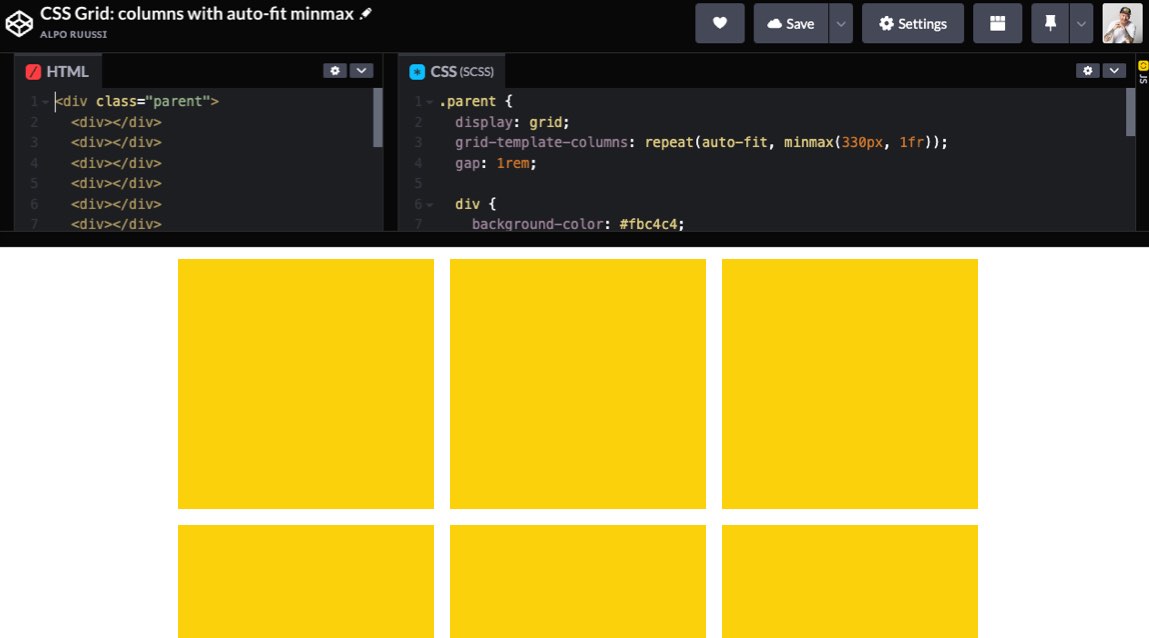
display: grid;
grid-template-columns: repeat(auto-fit, minmax(330px, 1fr));
What it does is it makes the container’s children be at least 330px wide while making them take all the space available with the auto-fit value inside the repeat() function.
It seems like there’s really not that much to it, but here are a few reasons why I think it’s great:
- no media queries and breakpoints needed
- you can easily adjust the spacing for the child elements by just adding a third line here; the gap property. No paddings, margins, or last-child CSS rule clutter for the children
- you can easily replace the auto-fit with a number of columns you wish to have at maximum.
#2 Grid with alternating children widths per row
Layout designs where every other row has alternative column widths and reverse flows are quite common nowadays.
They’re actually really simple to achieve par the nth-child() wizardry. On the CSS Grid side of things it’s just a few rows of CSS properties on the container:
display: grid;
grid-template-columns: repeat(3, 1fr);
And for the child items (in this recipe we have :first-child, :nth-child(4n) and :nth-child(4n+1) selected):
grid-column: auto / span 2;
The result: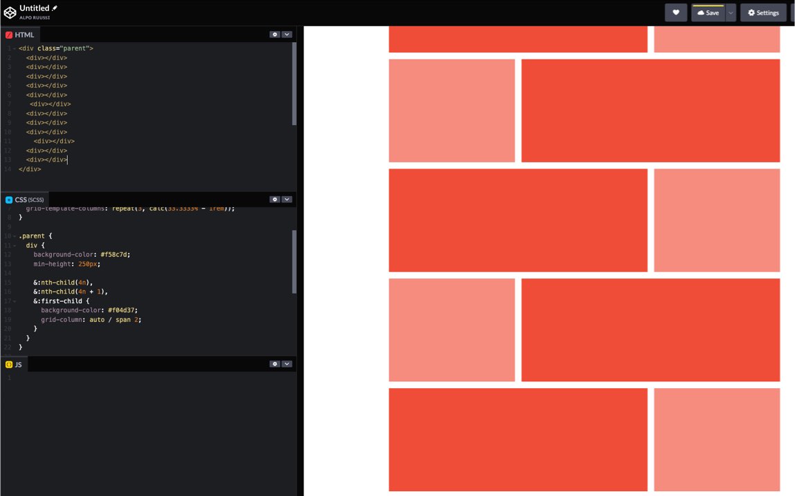
With just few changes, we can easily create a more complex-looking grid:
The container:
grid-template-columns: repeat(4, 1fr);
The child items (in this case the first one, every sixth and every sixth plus one):
grid-column: auto / span 2;
The result: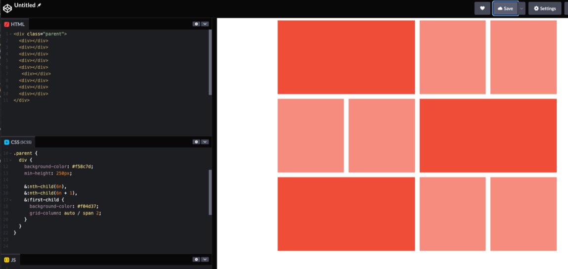
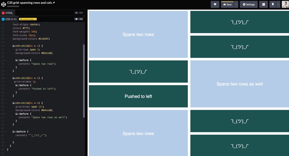
#3 Grid with items expanding rows and columns
The two previous ones had expanding columns, let’s look at another one expanding both rows and columns.
The container:
display: grid;
gap: 1rem;
grid-auto-columns: 1fr;
grid-auto-flow: dense;
grid-auto-rows: 250px;
The children:
div:nth-child(6n + 1) {
grid-row: span 2;
}
div:nth-child(6n + 5) {
grid-column: 1;
}
div:nth-child(6n + 6) {
grid-area: span 2/2;
}
As a side note, I don’t see why you shouldn’t use any Javascript masonry libraries for these. Minified they’re few kilobytes and most likely have options and settings to meet your requirements.
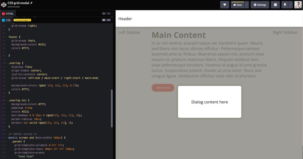
#4 Use CSS Grid to position a modal
I’m not a huge fan of grid-template-areas, because the property has that stagnant old-fashioned “table layout” feel to it. But as front-end developers and creators of cool and fancy things, we should be able to recognise when to get off our high horse and use tools and techniques that we’re not too fond of.
The last CSS Grid recipe here is great example of position a modal in a simple straight-forward way with grid-template-areas and its child items’ grid-area properties.
Note: The grid-area is actually a shorthand, bit like margin: top / right / bottom / left; but the flow is different: grid-area: y-start / x-start / x-end / y-end;
First, you declare areas for the grid container, something like:
display: grid;
grid-template-areas:
“head”
“left”
“main”
“right”
“foot”;
Now, with the areas set you can position the child item (the modal) using the areas “-start” “-end” values, like left-start, right-end, and so on.
Here I’ve set the modal’s grid area to:
grid-area: left-start / left-start / right-end / main-end;
The modal will now expand horizontally and vertically over the starts and ends of given areas.
Let’s say you want the modal to only overlay the main area. You could skip all starts and ends and write:
grid-area: main;
And boom, there you go: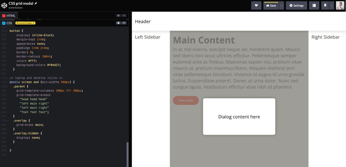
The biggest profit of using this CSS Grid technique for modals is the fact that you can skip the absolute positioning shenanigans, and just tell the modal which area to show up in when opened.
So, that’s about it. Hopefully, you find these useful in your own work. Also, let’s hope some of these recipes become obsolete in the near future with the grid-template-rows: masonry; making it’s way to browsers. At the moment (Fall 2022), it’s only available in Firefox with the masonry flag enabled in the browser’s config.
In the meanwhile, let’s run with what we got.


